11.13.2009

Keys!


Nobody loves keys like the Belwith Design staff! This drawing caught my eye since I've drawn a few keys, myself. It is by Georgina Fineman (http://cargocollective.com/1984foryou) a surface pattern designer featured on the blog Print & Pattern, which always has an amazing array of 2-D designs, with a lot of retro and modernist looks. Scrolling through them makes my eyes burn, but it's worth checking out: http://printpattern.blogspot.com/

9.21.2009

Trend: LED


LEDs are everywhere! It seems that they are popping up in many different applications, as seen in the photos. (and in these two a space theme!) For more home applications see http://www.trendir.com/.

Fashioning Technology

Here is an interesting site dedicated to technology forward fashion . . . or is it fashion forward technology?

In any case, there are a lot of interesting ideas. I'm not sure how they will come out in our hardware, but we'll just have to dream it up!

9.17.2009

Define it Quick: Parting Line

I was looking into how to make molds for chocolate and came across a term we use often during design/development: Parting Line.

Parting Line - is where two halves of a mold come together.


During design and model making, we establish that line so that it can be manufactured. After metal enters the tool, or mold cavity, it needs to be able to come cleanly from the cavity.

The above images were from the mold making website which sells the materials and has some nice how-tos for aspiring chocolateers and the like. Find more info here: makeyourownmolds.com

8.17.2009

Entry Redo (after!)


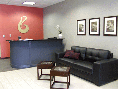
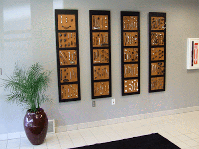
ta-DA! The entry is done! We put the finial pieces together last week. What do you think?!

A few other things to notice:

1. Framed historical pictures from 1893-1912 from Keeler with the new Belwith mission, vision, and values statements. Tim LaDuke, a Holland based photographer/artist, was able to print the photos over lunch while we ate some awesome burritos down the street. I used frames/mats from Target and the finished result is classy and simple.

2. Hardware wall. We used 4 wall displays, lucky that there were exactly 4 left from a previous project, and mounted display boards. The products shown are what our customers get for their showrooms and retail stores.

3. Plants. New (real) plant in the beet red vase and a fake orchid plant on the reception counter. Only my Grandma seems to know how to keep the real ones alive. Fake is better for a busy office!

4. Pillows. Kind of a small accent, but I sewed them. And I often fix them when people push them around on the sofa. It bugs me when they're out of place.


Gold Leafed Logo


Our red accent wall needed a bright logo. We toyed around with using sheet brass, metallic sticking paper, and spray paint. In the end, gold leaf won. I wandered around Hobby Lobby looking for a good metallic material and came across packets of variegated leaf, with colors of gold, copper, and light blue and greens. The variety of colors, I thought, would look great on the red.

Despite it being my first time using gold leaf, it was easy to follow the steps: prime, base paint, spray adhesive, brush on the flakes, and seal.

Irv and Gary, part of our model making team, cut out the 36" tall logo from a laminated MDF using a band saw. Jeff finish sanded and primed. I applied the finish. Jeff helped me to stick the logo to the wall (yea for tall people!).

You can see one of the pieces in progress and the finished logo. It seems to be a hit.

Reception Desk Fiasco


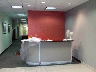
Our efforts to reuse the reception desk turned in to a mini nightmare. The painting of the base went as planned: dark grey paint sprayed on and let to dry. The painting of the four surfaces (2 for the desk, 2 for the counter) became a pain in the you-know-what when the black paint WOULD NOT DRY! After two weeks of it air drying, baking in our finishing ovens, and sitting in the sun, it still could not be considered completely dry . . . so we sealed it. (This was actually Jeff's decision and I think he was a little nervous about doing it.) The 2 desk surfaces have done ok so far with the water based poly. The upper surfaces were sealed with a thick mixing resin, like the thick clear coating you'd see on a bar or restaurant table.

It truly became a "fiasco" when the thick resin hardened too quickly and in some parts pulled away from the paint. It was not consistent enough to claim that that was the texture we were going for: smooth and thick as glass, then bubbly, then not even covering the paint, all on one surface. It was gross! Our finishing expert, Bob, said they were fire wood.

After the resin failure we used bondo to fill the dips. After sanding and priming I determined there were still too many imperfections to paint and poly it. I decided to re-texture it with drywall compound (spackle), primed, and painted it with loose brush strokes. After a coat of poly, it resembles a venetian plaster look. And I've gotten a lot of compliments on it.

The previous explaination of the steps we went through probably bored or confused you; we were just frustrated. To say the least, I'm glad that the surfaces are done.

7.29.2009

Table Upgrade with Marble


My roomie Lauren had the great idea to add marble to these otherwise plain, contemporary tables (from American Signature furniture). We picked out tiles from Lowe's that have a brown/black background with veins of white and pink. The pink was supposed to pick up the accent wall color which is a red shade. Irv, Model Maker and fine woodworker, inset the tiles. $5 for the marble tiles and additional labor, you can't go wrong.

Reception Desk, in Progress


Here you can see our finish engineer putting on the first coat of paint to our reception desk. We usually use the spray booth behind him for hardware and other small projects, but this piece was too large. It's nice to have a facility and know-how to be able to do the work in-house. Thanks Bob!

RMS Studio Jewelry


Check out the website of the same name (http://www.rmstudiojewelry.com/) for more extraordinary examples of fine craftsmanship. Her process involves anodizing silver and using a tiny drill to puncture through to the bright silver underneath. Precise, delicate, and unique.

Glowing Wood Sculptures


Turned wood glows from a light within. The booth was dark and these lights did not look like wood at first glance. I had never seen something like this. The website is ok, see for more examples: http://www.glowingwoodsculputres.com/

Printmaker Wroblewski


Another artist from the AA Art Fairs. Great compositions and a wide range of subject matters. The intricacy, number of colors, and the "white" space changes per piece. Refreshing to see such a collection of work from one artist. Check out more work on his website: http://www.nickwroblewski.com/

Sculptor Robbins


This artist was lacking the enthusiasm to talk with us about process (borderline rude), but his sculptures contain movement and grace and had beautiful finishes. The website stinks though you can see more works. http://www.robbierobins.com/

Paintings by Daniel J Barry


An artist we spotted at the Ann Arbor Art Fairs. He had nice compositions and great use of color: purple and lime green? Turns out he also does architecture. Check out his website for more: http://www.danieljbarry.com/

Stars of the A.A. Art Fairs

Our design group took a day trip out to the Ann Arbor Art Fairs. Artists travel from across the country to show their works and the quality of their work is HIGH. We enjoyed seeing a variety of mediums: woodworking, sculpture, 2D paintings, prints, etc, and jewelry. (Most) people we talked with were nice, thoughtful, and willing to share their tips and tricks. See following posts for individual artists . . .

7.20.2009

Corporate Entry Update (during)

The painting is done! Engineer Jeff stayed late Friday to help prime and we came back Saturday A.M. to put on the top coats. The accent wall is as close to our Belwith red color as I could match with paint chips at the hardware store. A designer here suggested that I could have gotten paint that was the Pantone color . . . perhaps next time. Has anyone done that?

After painting, my friend Lauren and I took off to see what furnishings were available within the budget. A new sofa and cocktail tables are on order! Her creative idea to use marble will bring texture to the tables, for which I've signed up the model makers to help realize her vision. I love working with creative and skilled people - so much is possible!

Now, to figure out what material to use for the logo . . . It's going on the red wall. We've discussed brass, gold leafing, and sandblasting mirror. If you have any ideas, please leave a comment. -Thanks!

Corporate Entry Update (before)

I have a small budget and free reign to update our entry area. For a design (and delivery) centric company, our environment has been pretty boring and, as you can see from the pictures, it leaves much to be desired. It probably hasn't been touched in 20 years. The plan includes paint, more modern furnishings, revamping the receptionist's desk, and artwork that shows our company history and new Belwith logo.

I hope to have everything done within 2 weeks. Stay tuned for the during (and after) photos!

6.17.2009

Copyright 101


Throughout the years, Belwith Products and its predecessors (Keeler, Belwith Int, Hickory Hardware) have put copyright symbols on the parts and have sought design protection in the form of patents. We know first hand how complicated the process can be!

For those interested in basic information about what a copyright is or if you need some tips on getting started in filing a copyright, visit the Design*Sponge site here. Advice by Amy J. Everhart who has her own law firm and blog is targeted to individuals in the creative community.

WARNING! You'll probably learn something!

6.09.2009

Define it Quick: Bail


A bail is a piece of hardware usually free-moving which is grasped to open a drawer. In the picture, it is the "u" shaped piece.

6.01.2009

Define it Quick: What's this?

This is a new feature for the Belwith Blog. We're going to quickly define hardware and home furnishings terms, hence the feature's name: Define it Quick!

Thanks for getting this idea going Deb!

5.21.2009

National Geographic: Patterns in Nature


Inspired by nature . . . I think most of us are. Upholstery patterns, furniture forms, inlays, and even our hardware designs feature plant and flower motifs. Perhaps these close-up pattern studies will inspire you. I like the saturated colors and the clarity of focus. Click here for more.

On the Street Fashion


In order to NOT violate the copyright . . . I'm not posting pictures from this photo blog: The Sartorialist But the pictures are amazing to look through. I'm a bit of a people watcher and the designer in me loves seeing what "looks" people put together, especially from around the globe. The above picture I took in Milan. Love the orange-on-orange! Not something I see everyday in Michigan!

I've heard that European fashion comes over to the States. Also, that home furnishings follows fashion. This type of site could be good for getting a glimpse into what people currently, or will soon here, find desireable. (probably not the orange-on-orange though!)

IKEA Hacker


I really enjoy seeing the creativity of people, designers and non-designers. The IKEA Hacker blog showcases great solutions to everyday problems and some plain old funky stuff. The above bench was made of IKEA parts and holds a litter box. Nice huh? Looking at civilian solutions could help designers create products that fill a real functional need.

Click here to see some fun projects.

5.14.2009

Google "Spider Web" Design


While I'm not a huge touter of Google, I do use it. Today I saw and messed around with a new format for searching, called: Wonder Wheel. Click "show options" to see this option and start searching by a visual web.

Furniture that Attaches

This table is meant to sit over a balcony, rail, wall, or where ever. It makes me think of other places that furniture could hang, hide, fit around, etc.

See IKEA's website for more info on this cheap problem solver.

5.08.2009

Poll Results: "Which show are you attending?"

Well, our second poll revealed that 2 people were going to Market and 1 person was going to KBIS! Check out a new poll on the right . . . let's see if we can't get the participation up!

5.07.2009

Inspiration: Textiles


I'm impressed with the products of Mogwaii, a British textiles firm that makes home furnishings and accessories from wool felt, embellished with simple stitching, found rocks and shells, and silhouette motifs derived from nature. I like the simple shapes and layering of pattern and texture. The delicate stitching reminds me of some of the incised lines we incorporate into our own product. We've been seeing stones used as decorative features in other home furnishing products, including cabinet hardware.

4.13.2009

An Inside Look: the Overview


This series of posts will give you an inside look into our process and help to answer the question, "What do you do?" which I often explain to those outside the industry . . .

In the simplest terms we develop products, most of which can be found here. We come out with new hardware twice a year for retail and work with furniture companies to meet their introduction time lines. (And as seen above, we have the fun task of creating corporate artwork!)

The retail and showroom designs are created and narrowed internally. We have the freedom to determine what the company comes out with. The factors we consider are: price point, manufacturing process/materials, and design/finish aesthetics.

Working with the furniture companies is a little different. We develop concepts for their consideration, but usually we are brought into the project after the direction is decided. Often our work is done around their sketches or CAD drawings. Overall I enjoy working with outside designers and appreciate the part we play. It's rewarding to see your work under spot lights at market (which is coming up soon!).

So, to sum up this post: we design hardware in-house for retail/showroom markets and work with furniture companies to provide original designs for their new introductions.
Stay tuned for more "Inside Looks"

Love it or Hate it? Moustache furniture . . .


"Moustache’s aim is to bring together a group of like-minded designers to nurture the development of innovative and honest furnishings that will stand the test of time." yatzer.com

It looks like junk to me. Some of the pieces look like cheap IKEA and others look dated to the 80s. I suppose this is the "anti" posting of what I find inspiring. Just to make sure though, do you agree?

4.06.2009

Our first poll results are in!

The first poll conducted here asked you to finish this thought: Home furnishings are becoming more:
Traditional
Contemporary
Rustic
Unique

The poll results indicated a majority win of: Contemporary.

Please participate in our new poll to the right - since my company participates in both retail and OEM hardware business, I'll be travelling to both!

4.03.2009

3 Questions

I found a brief article online which included Niels Diffrient's career highlights and three questions with his answers. I am going to post my own answers in the comments -- you should too!

"While a student at Cranbrook Academy of Art in the late 40’s early 50’s, Niels Diffrient also worked as a designer and model-maker in Eero Saarinen’s practice. This is just the beginning of an illustrious design career in which ergonomic study and design has become a passion and expertise. Designing office seat furniture for Knoll and Sunar-Hausermann in the 80’s preceded Diffrient’s current pursuits at Humanscale, the ergonomic workplace furniture and accessories design manufacturer." - http://www.otto-otto.com/2009/04/3-questions-niels-diffrient/


What is your favorite example of great design?
EARTH

What is the most memorable moment in your career as a designer?
BIRTH

What is the most important factor that influences and/or inspires your design process?
SLEEP

(click on comments to see more designers' answers)

3.31.2009

Color on the Brain


Every now and then there are certain colors I'm drawn to . . . and seem to notice them everywhere. Recently it has been a light red with a slightly orange tint. I've seen it at the drugstore: "copper" nailpolish, and in clothing. Today I found it in a photograph on: http://day-lab.blogspot.com/ (seen above in the bird's wing)

Below is a color combo that I'm keen on: black/charcoal, bright green, warm grey. I've seen this around same as the red.

Does anyone else have this type of color awareness or change "favorite" colors frequently?


Advice: State of Design


This is an excerpt from an interview with Allan Chochinov of Core77, the full article can be found here: http://www.designglut.com/2009/03/allan-chochinov-of-core77/


We always ask people what their advice is for young designers. What is your advice?

That’s probably a more complicated question now than it’s ever been. It used to be, “Should I start my own business, or should I work for a consultancy, or should I go work at an in-house department at a larger company?” Many things have changed to alter that equation. We have this amazing convergence of awesomely powerful tools of creation and insanely powerful tools of dissemination.

Designers have never been equipped with so much ability in terms of 3D software, materials technology, or the ability to get questions answered…almost instantly. Designers can send out their stuff to design sites, or post it in online portfolios. A piece of work can find its way around the world in half a day, and suddenly you can be a hit, fielding inquiries for more press, or orders, or nibbles from potential manufacturers. I’ve seen it happen many times.

The other things that have changed are more sober. Designers are the people who have these unique talents and methodologies around ingenuity and innovation; who are problem solvers. And given the magnitude of the problems right now, the world needs designers more now than ever. It just may not need them to design teakettles or toasters or MP3 players.

Happily, for a lot of students I meet, this isn’t a burden. Design students, for all their eagerness to design “cool products,” really do seem to come out of the box interested in design for social good, in making a difference and creating meaningful experiences for people. I think the future’s never been brighter for design, and it’s incredibly gratifying to support the field both through teaching and through my work at Core77.


We hope that Designers' Forum will lead to idea sharing as was intended with Core77, and become a tool for our needs as problem solvers.


3.26.2009

Wood + Plastic


Alexander Pelikan's 'Plastic Nature' series made from wood and injection-molded plastic for all the joints. I'm reposting it from NOTCOT, but to see more pictures: http://totonko.com/2009/03/naturaleza-plstica-alexander-pelikan/

Would residential companies get in to a new process like this? Would designers be "freed" from any manufacturing constraints? Might be neat for hardware . . .

Computer Painting


I ran across Dan Milligan who does awesome things in Corel Painter X. I usually switch images on my desktop frequently, but haven't found one better yet! Painter X uses his work to promote their program . . . has anyone had much luck doing computer paintings?